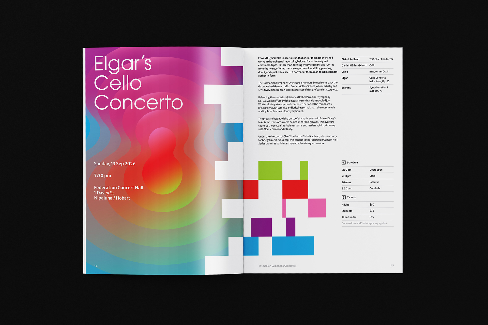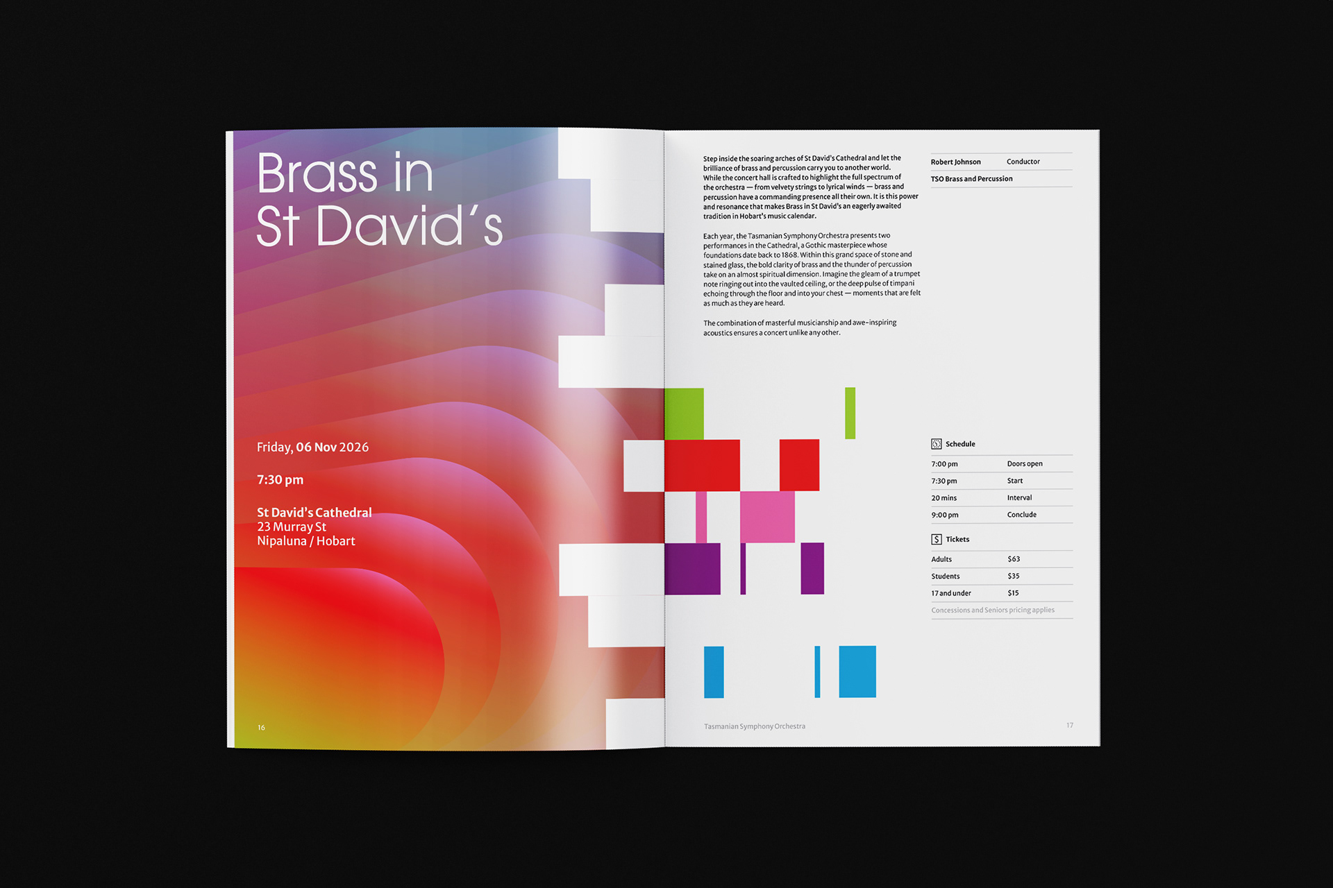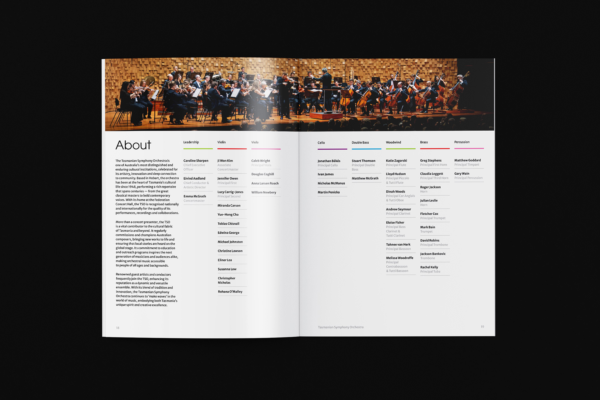


Tasmanian Symphony Orchestra
Student Work / 2025
Brand Identity / Editorial Design / Motion Graphics
Brand Identity / Editorial Design / Motion Graphics
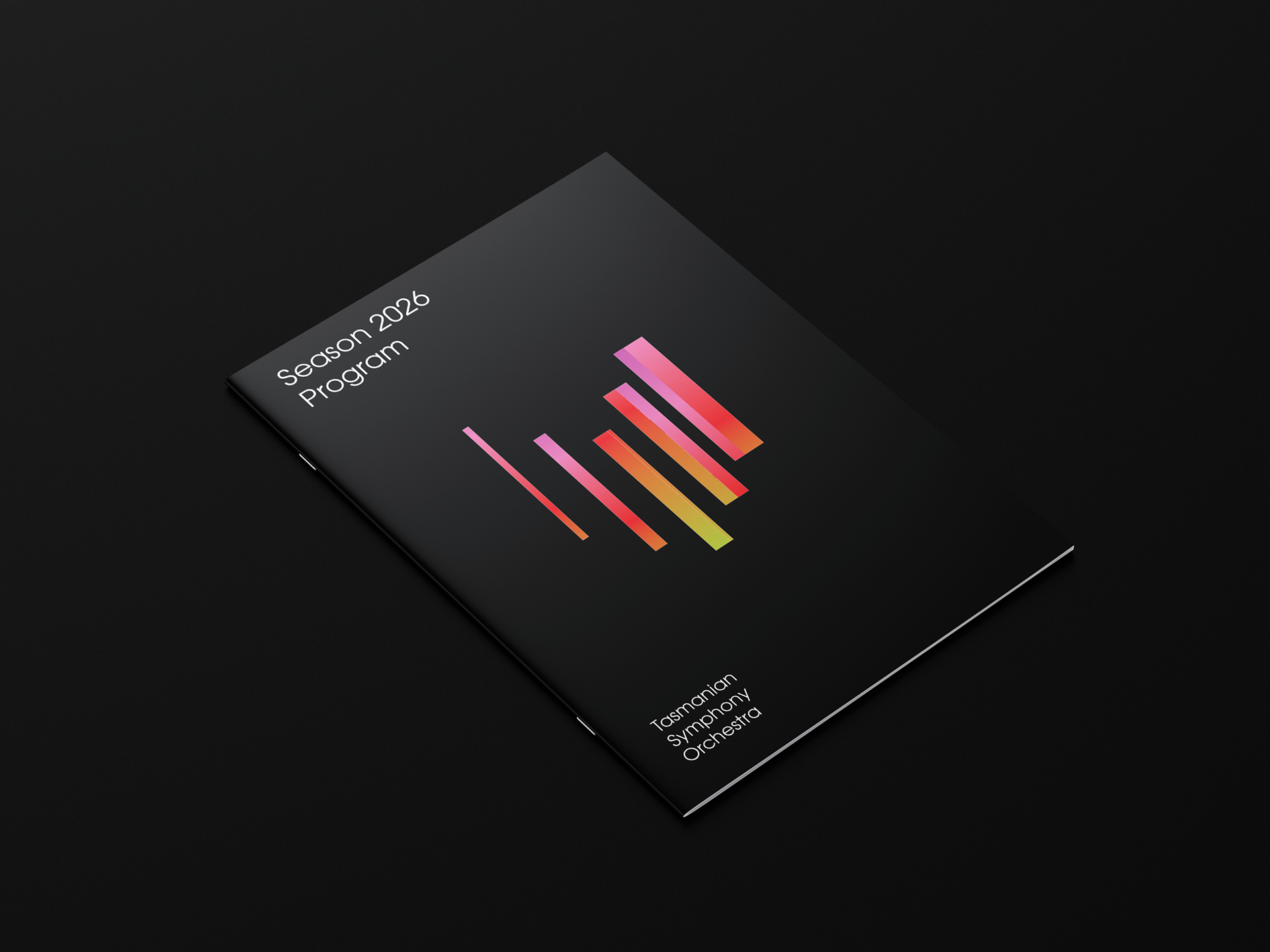
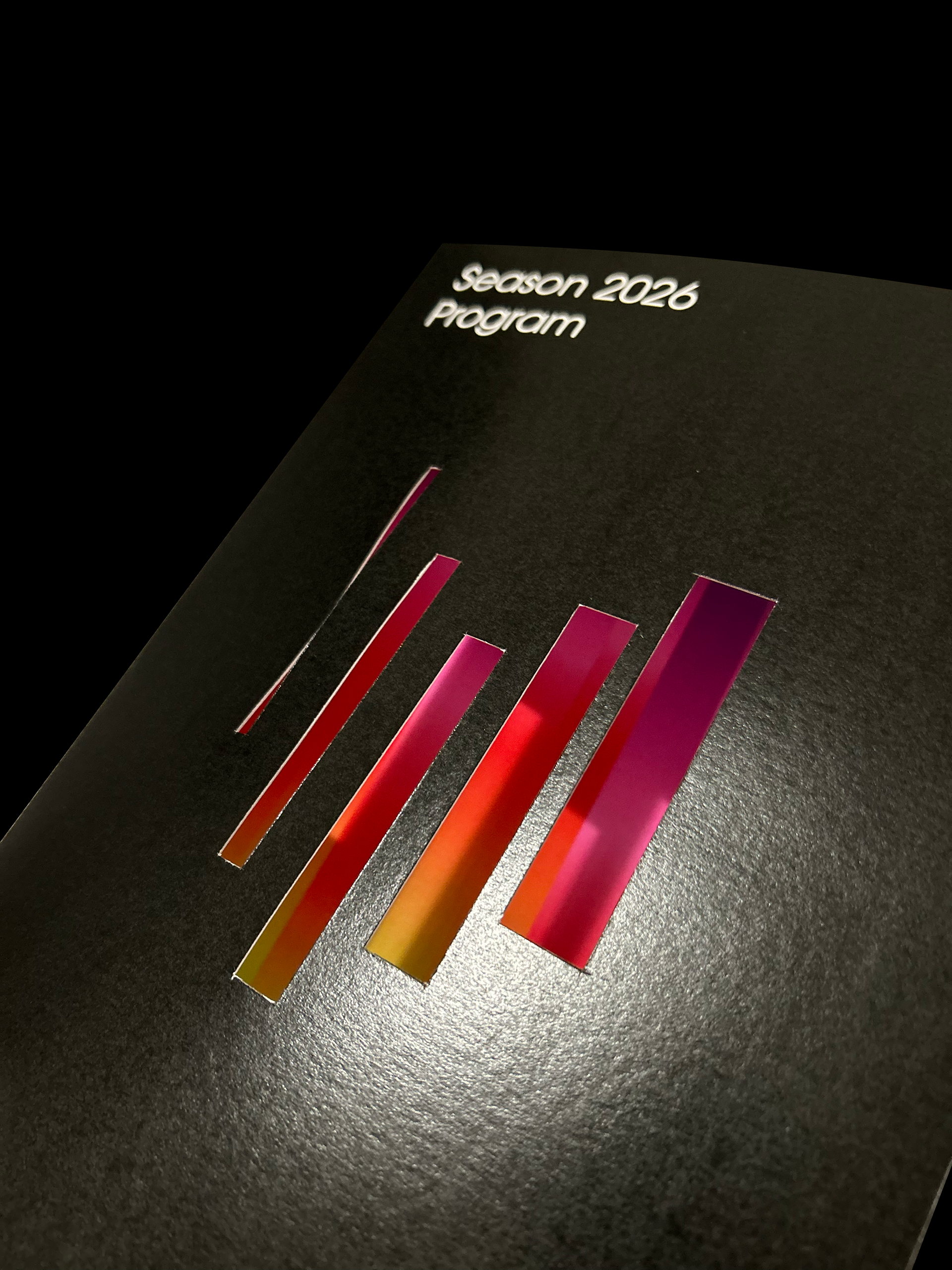
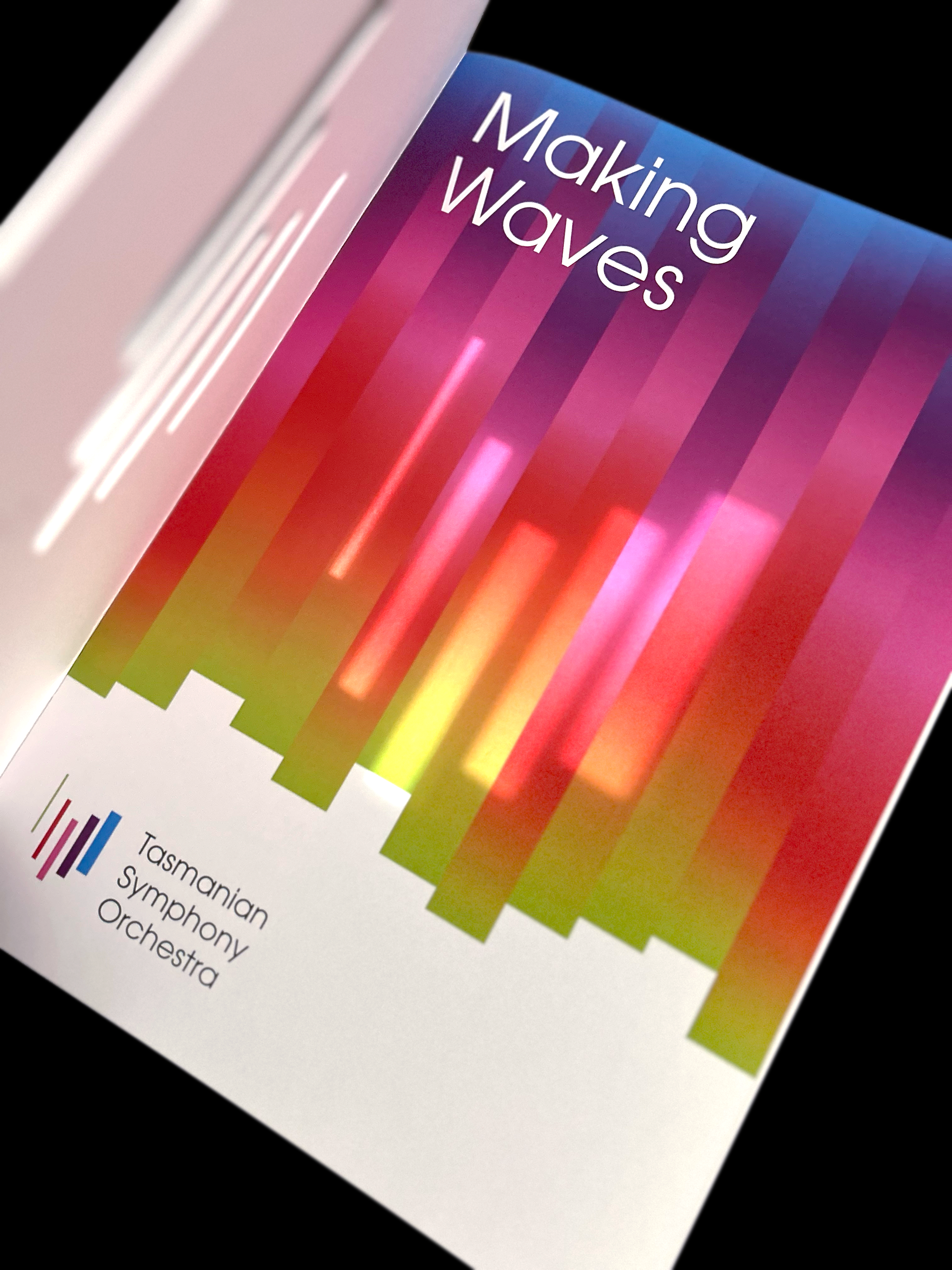
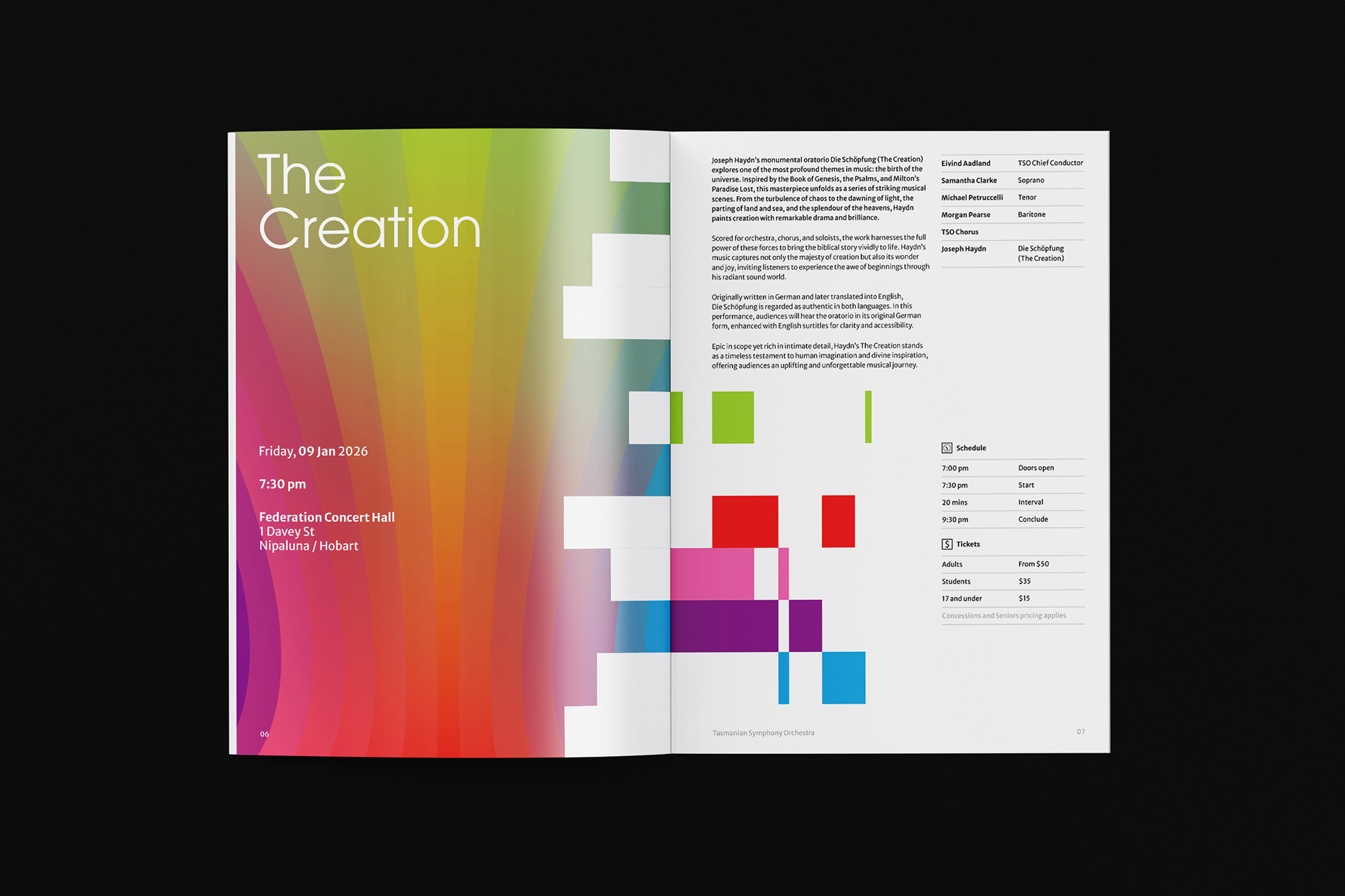
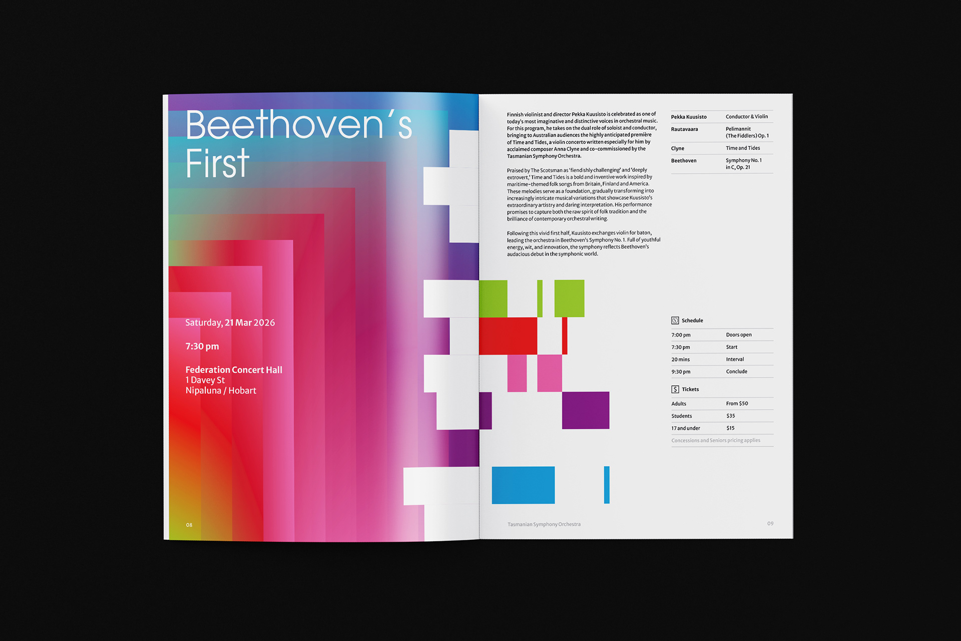
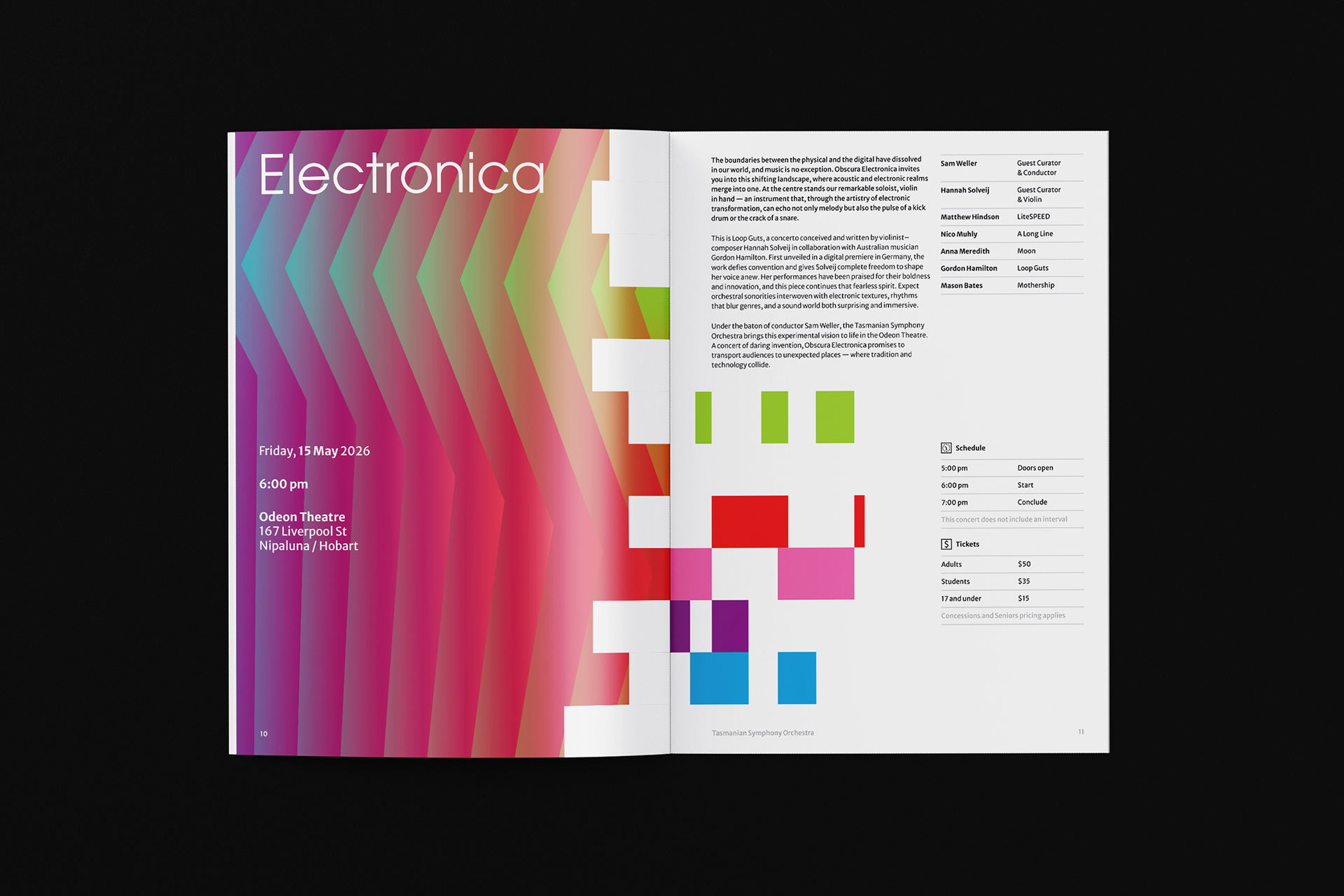
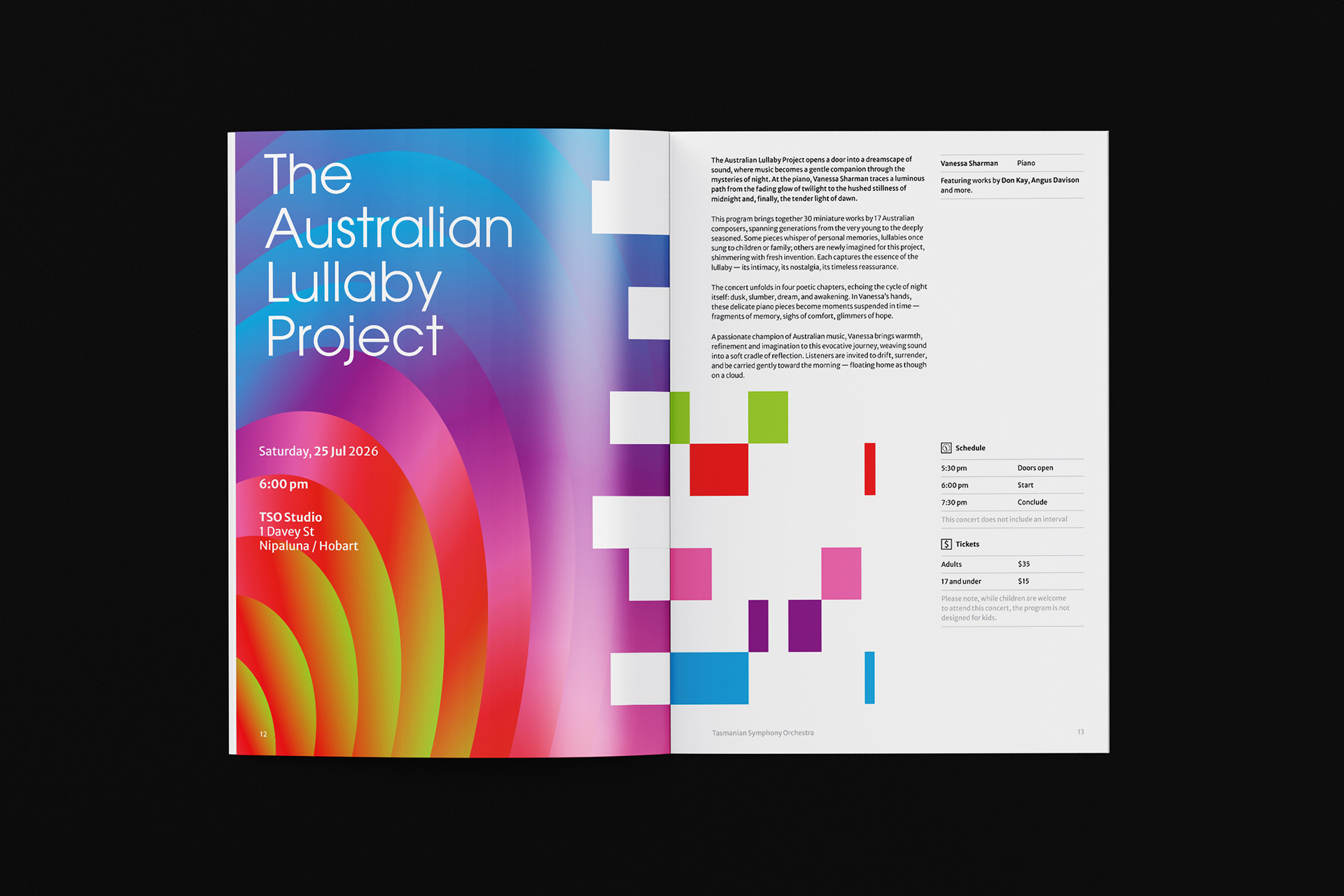
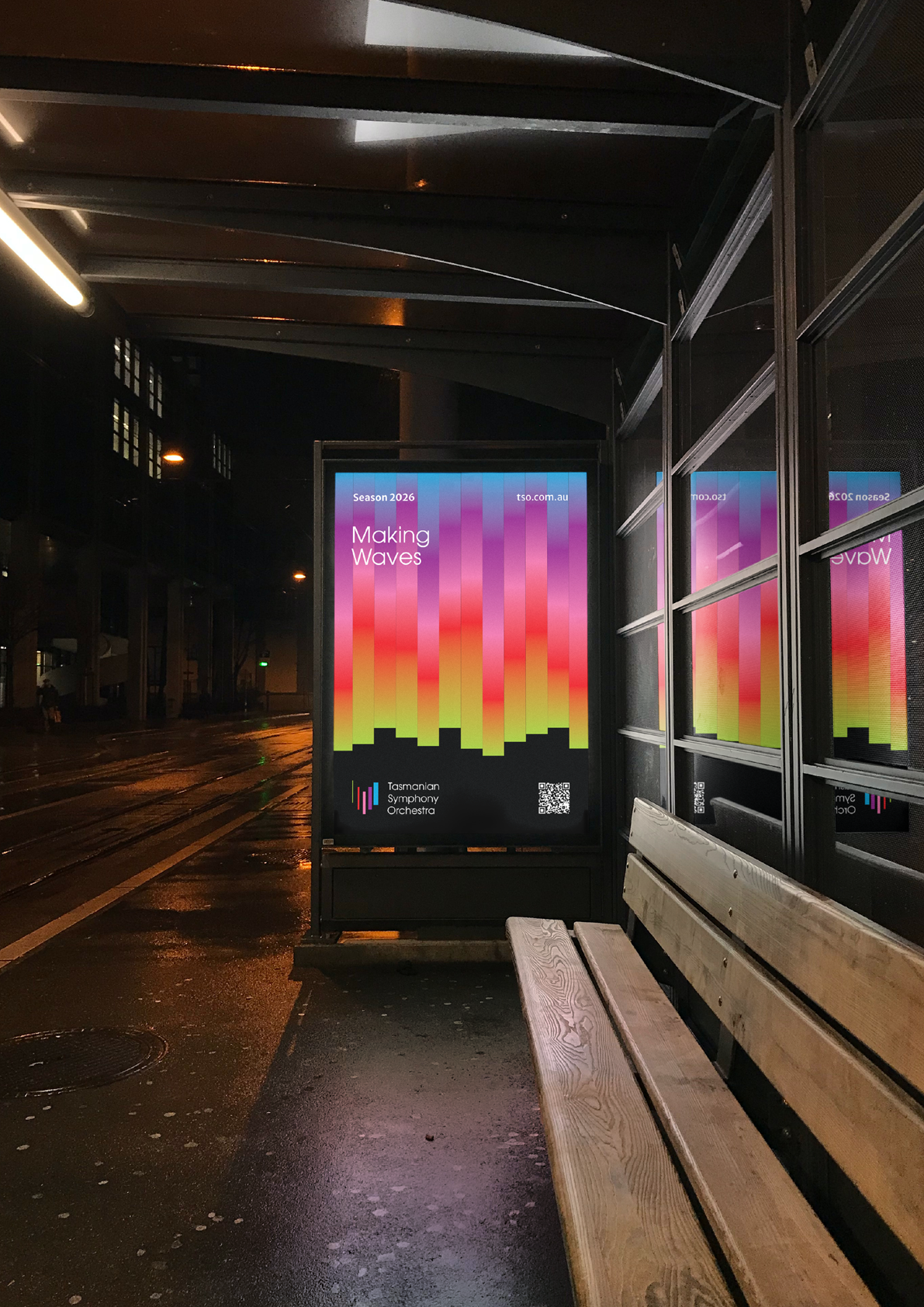
Tasmanian Symphony Orchestra rebrand introduces a logo with an abstract representation of the Tasmania island, constructed with five columns — a reference to the musical staff. From left to right, the columns grew from thin to thick, with narrowing gaps in between, descending then ascending, suggesting movement and rhythm. Brand colours are inspired by the vivid, magical Southern Lights. This multicolour, asymmetrical approach symbolizes the union of different musical instruments played by and for people from all walks of life.